[CLOSED] Extension Manager font is hard to read on Windows #4215
Comments
|
Tagging Sprint 28 since we should at least consider whether we need to do anything here before shipping. We might also want to scrub the UI for other uses of light+small Source Sans that would experience similar issues. |
|
I can confirm that small text in other places like the About dialog is also affected. (Also in the About dialog, you can see a change in image antialiasing -- all the gravatars are shifted about 1px within their frames). But I don't see hue changes anywhere other than the text, so this appear to not involve color profiles directly. It may be that something about compositing or antialiasing changed at the same time (or in support of the color correction) that is causing this. |
|
The CEF change definitely only affects text rendering in mainstream cases -- I've verified on a number of websites now. Text is noticeably thinner (especially small text) and colored text is noticeably desaturated, but images and background fills are completely unchanged. |
|
|
|
With workaround: IMHO since this is primary content it's ok for the text to be less grayed out... |


|
I agree |
|
Did some further research. Looks like this is caused by Chromium bug 146407, which has the same symptoms: fainter text and desaturated text colors only/especially on Windows. It broke in Chrome 22, which matches what we're seeing: in Sprint 27 we upgraded CEF from 1180 to 1453, which corresponds to upgrading from Chrome 21 to Chrome 27 -- and that's indeed when we first saw the problem. (Considering that was jumping forward 10 months in Chrome's history, I'm almost surprised that font rendering and a couple V8 crashes are the only unexpected changes we've seen!) |
|
Damn… hope that's a high priority bug for the Chromium Team. |
|
There's a comment in that bug by a Chrome dev saying the cause is that Chrome has started assuming all displays are calibrated to sRGB because "most displays today" are (which in my experience isn't true). It also seems that no other browser (including Safari) makes that assumption, judging by all the comparison screenshots there showing Chrome differing from the rest of the pack. But the developer comment almost suggests they consider it NAB. Would be interesting to get thoughts from some in-house font experts here (e.g. TypeKit) on what sorts of colorspace/gamma assumptions are safe... The bug comment thread near the end gets a little jumbled up with a different issue (137692) where certain poorly-hinted webfonts render with no AA at all on Windows. That's blocked awaiting DirectWrite support and was never working; whereas the "spindly" AA that's the issue here is effectively a "regression" from Chrome 22 onwards. There's plenty of momentum on the DirectWrite stuff but unfortunately little or none on the "spindly" issue we're hitting -- although it's possible using DirectWrite for all text would remove the sRGB assumption and go back to whatever the OS assumes natively (which seems more correct given that text looks better in IE). |
|
One interesting thing to note about this is that the effect depends on text brightness -- all text gets paler, so light colored text actually got fatter while dark colored text got more spindly. You can see an example of light text "fattening" if you compare the working set list between sprints. |
|
For example: The font size is a little bigger in dialogs, so it's not nearly as bad... but it's still noticeably thin. Do you think those are hard-to-read enough to warrant correcting too? |


|
Closing. We'll file a separate bug for the other dialogs and punt that to next sprint. |
Wednesday Jul 24, 2013 at 00:44 GMT
Originally opened as adobe/brackets#4554
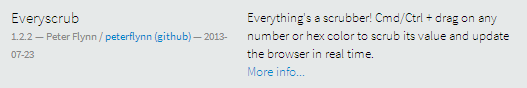
The small, extra-lightweight font used for extension descriptions is very spindly on Windows, making the text hard to read and less attractive.
This seems to have regressed from before. Today:
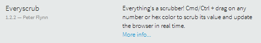
Sprint 26:
I'm guessing this is the same Chromium/CEF font rendering change that caused #4391...
The text was updated successfully, but these errors were encountered: