Move allotments to some kind of green #3411
Comments
|
sent from a phone
On 24. Sep 2018, at 00:33, kocio-pl ***@***.***> wrote:
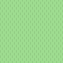
Currently allotments are dark orange with white dots. We have just changed farmland color to a shade of green, because it makes sense to have all the vegetation areas in green.
It is a decision whether to show the differences in non-built landuse prominently or whether to make them look more or less the same, and depending on this decision it makes sense or not.
|
|
Difference between farmland, garden or forest is prominent in my opinion, yet they all fit into vegetation and use shades of green. Using dark orange makes allotments closer to sand for example or built-up landuses (but more intense). |
|
If I understand correctly, allotments are community-owned land which is
used for family vegetable gardens?
So it is a type of intensively-used farmland with small plots, usually
growing annual crops.
I believe option 3, “Farmland background with garden dots”, works well for
this situation. It is similar in use to “farmland” (which usually means
“cultivated annual cropland”, because orchards have their own tag).
The regular dot pattern suggests small patches of different crops, which
gives the right idea, if I correctly understand these to be “community
(vegetable) gardens” in the American sense
Joseph
…On Mon, Sep 24, 2018 at 7:50 AM kocio-pl ***@***.***> wrote:
Difference between farmland, garden or forest is prominent in my opinion,
yet they all fit into vegetation and use shades of green. Using dark orange
makes it closer to sand for example or built-up landuses (but more intense).
—
You are receiving this because you are subscribed to this thread.
Reply to this email directly, view it on GitHub
<#3411 (comment)>,
or mute the thread
<https://github.com/notifications/unsubscribe-auth/AoxshBO83tRfJUJDGSFcq1CJ6KOnsfWXks5ueBAhgaJpZM4W16Qr>
.
|
|
They are individual parcels of gardening for vegetables, fruits or flowers: https://wiki.openstreetmap.org/wiki/Tag:landuse%3Dallotments#Description |
|
Is there something else that you're planning on using this colour for? I don't see a big need for making a change - especially as your examples there are too close to other colours. It would be great to have an image with all of the green colours together, showing grass, meadow, park etc. as I can't visualise what colours are currently used in osm-carto. |
|
I have no such plan, but in such a big and complicated project it's hard to live with arbitrary choices. It's always better to have some system and we're slowly doing such changes. For example I had no idea that changing playground color will make space for ice rink in the future (see #3330 (comment)), but it made sense to make it green (as other leisure objects) rather than blue (see #2249 (comment)). |
|
@kocio-pl I like farmland colour with garden dots. It would match planned amenity areas colour (#1991 (comment)), as allotments are partly an amenity areas and partly natural landcover areas. Do I see properly that there is no outline for allotment area? I think it should be used the same as amenity areas have it. Yesterday I started playing with
Notice also that in eg. Poland allotments often has no gardens, but just little houses with small grass areas around, so it's not obvious for me that they are always kind of garden, what gives the reason to avoid green shade here. @boothym see: https://wiki.openstreetmap.org/wiki/AreasTab PS. I just noticed that you called new colour of farmland "shade of green". It's not green, it's yellow! ;) |
|
How intensively the allotment is used for growing vegetable depends a lot. |
|
2018-09-24 0:59 GMT+02:00 jeisenbe <notifications@github.com>:
If I understand correctly, allotments are community-owned land which is
used for family vegetable gardens?
the tag doesn't make assumptions about the ownership of the land
So it is a type of intensively-used farmland with small plots, usually
growing annual crops.
it may be in some instances (and producing food for proper consumption was
the leading idea at the end of the 19th century when they were invented),
in the cases I know, nowadays it is more a kind groups of residential
gardens not directly attached to a dwelling.
You can typically find them in bigger cities where they often occupy
"remaining" land, which is not suitable for building houses (too small, too
close to railways, etc.), or which is a temporary usage of the land until
it get built up, an it might in some cases also be perfectly usable land
purposefully set aside for this kind of landuse.
|
|
Re “in Poland allotments often has no gardens, but just little houses with
small grass areas around”
Is this correct use of this tag?
…On Mon, Sep 24, 2018 at 3:48 PM Tomasz Wójcik ***@***.***> wrote:
@kocio-pl <https://github.com/kocio-pl> I like farmland colour with
garden dots. It would match planned amenity areas colour (#1991
<#1991>), as
allotments are partly an amenity areas and partly natural landcover areas.
Yesterday I started playing with leisure=parkcolour, because I see it
quite "crappy" in compare with the rest of osm-carto palette. I noticed
that there is many of green shades used for areas which might be not
covered by plants, so I think we should avoid adding more green to map.
- landuse=cemetery
- tourism=campsite/ caravansite
- leisure=playground/ fitness_station/ dog_park
- leisure=pitch
- leisure=golf_course, miniature_golf
Notice also that in Poland allotments often has no gardens, but just
little houses with small grass areas around, so it's not obvious for me
that they are always kind of garden, what gives the reason to avoid green
shade here.
@boothym <https://github.com/boothym> see:
https://wiki.openstreetmap.org/wiki/AreasTab
—
You are receiving this because you commented.
Reply to this email directly, view it on GitHub
<#3411 (comment)>,
or mute the thread
<https://github.com/notifications/unsubscribe-auth/AoxshFrkIcveiB3gdwcRiWCNE9xyDE2hks5ueIBLgaJpZM4W16Qr>
.
|
|
2018-09-24 9:51 GMT+02:00 jeisenbe <notifications@github.com>:
Re “in Poland allotments often has no gardens, but just little houses with
small grass areas around”
Is this correct use of this tag?
if you consider the "small grass areas" a garden, then probably yes. Small
houses (cabins/huts) are typical for allotment gardens, usually every plot
has one (storage of tools, a room to sit, maybe even sleep sometimes
(formally it is often forbidden to sleep there).
Here's an example picture how these often look like in Germany:
https://www.germanpulse.com/wp-content/uploads/2011/09/Schrebergarten2.jpg
Cheers,
Martin
|
|
"Allotments are also closely related to vegetation" but also it is a recreational area and often temporary or permanent (e.g. in the summer) residence. "Using dark orange makes allotments closer to" residential area. Edit:
The color of the residental area by the years has changed. okay. Maybe now time to allmonts. |
|
I feel it's not this way. It's always about some kind of vegetation, but the residential role is restricted ("not for permanent residential purposes"). Also orange is closer to commercial or retail (which are reddish), but not to residential area (which is gray). |
|
I've got to say I am very confused by the different use of
landuse=allotments in central Europe vs Britain vs North America.
Over in America the landuse=allotments tag is used for community
vegetable gardens which have separate plots for each person or family.
(leisure=garden with garden=community is an option, but isn't commonly
used)
The wiki page seems to be based on British usage of the term,
including that the land is not owned by each family, and it is used
for growing vegetables and flowers:
"In allotment gardens, the parcels are cultivated individually,
contrary to community gardens where the entire area is tended
collectively by a group of people. The individual size of a parcel
typically suits the needs of a family, and often the plots include a
shed for tools and shelter, and sometimes a hut for seasonal or
weekend accommodation. The individual gardeners are organised in an
allotment association which leases the land from the owner who may be
a public, private or ecclesiastical entity, provided that it is only
used for gardening (i.e. growing vegetables, fruits and flowers), but
not for permanent residential purposes."
So, it seems like the original purpose of this landuse was for
small-scale farming.
…On 9/24/18, kocio-pl ***@***.***> wrote:
I feel it's not this way. It's always about some kind of vegetation, but the
residential role is restricted ("not for permanent residential purposes").
Also orange is closer to commercial or retail (which are reddish), but not
about residential (which is gray).
--
You are receiving this because you commented.
Reply to this email directly or view it on GitHub:
#3411 (comment)
|
|
Because it can be similar to farmland and garden, I've made another proposition with 50% mix of both colors:
|


|
Less aggressive dots (0.5 opacity) and only 30% of grass to make it look a bit more different than garden:
|


|
@kocio-pl Can you make version with 50% colour mix and 0.5 opacity dots? |
|
Sure:
|


|
How does that compare to other pattern-usage in this category? Orchard and garden comes to mind. We need to be able to distinguish them. |
|
Sure. Are there any places where allotments and orchards or gardens are close to each other? In the meantime we can look at https://wiki.openstreetmap.org/wiki/AreasTab examples: 30% garden/farmland mix garden plant nursery orchard vineyard |


|
30% mix with 0.5 opacity orchard dots:
|


|
Close to each other (garden and 30% allotments)
|

|
Thanks for pointing me to that page, and to @geozeisig for maintaining it.
|
|
I think dots opacity is not needed - 30% mix with orchard dots (this is the same pattern as currently, but black instead of white - footpaths are better visible):
|

|
There are more patterns available in new version of @imagico pattern generator, like rings for example: |
|
@kocio-pl Please upload some test renderings comparing 50% mix with 30% mix (both with orchard pattern) on mid-zoom levels. I would like to see espessialy how would it look in 2 cases: surounded by farmlands and surrounded by some green areas. I think it's important to rate possible colours in these situations. |
|
White rings on E4EFCA (imagico ring 6 thick dist 15)
White squares 8 on E4EFCA (dist 15)
White square rings 8 on E4EFCA (dist 15)
|


|
OK, I've made a PR with version 10: |
|
Struggling to see the purpose of this amendment. The outcome is a bit too much like garden. 'Before' is best option. |
|
Dave, I am struggling to find your constructive contributions during the 3 months of discussing this matter. Please note however that the finally chosen pattern is in the PR #3548, not here in the top post. Certain similarity to garden is intentional, since the contributors here indeed consider both features similar. The white-square pattern makes the rendering however distinct enough to distinguish them. |
|
@polarbearing - dismissing critique because it was not brought up at the right time according to some opinion is not a good idea. @DaveF63 stating his view here now is completely fine. |
|
Dave,
The idea was that allotments are a type of garden in the broadest sense of
garden as a place where plants are cultivated for human enjoyment. So we
wanted to use a shade of green to show that it is a vegetation related
feature.
We tried some options similar to farmland and grass, but could not find a
color that was easy to distinguish from grass areas and farmland at lower
zoom levels. We also considered using the orchard/vineyard background.
The we settled on the garden background color but with a distinctive
pattern, as seen now
However, @imagico recently suggested a different color scheme on his
branch, with allotments in a less saturated green, perhaps more on the
blue-green side. This is an option that we did not consider.
http://blog.imagico.de/more-on-vegetation-rendering-in-openstreetmap-maps/
I can show some test images with this color, if it isn’t too similar to the
new scrub color, if others are interested.
…On Sat, Dec 29, 2018 at 11:29 PM DaveF63 ***@***.***> wrote:
Struggling to see the purpose of this amendment. The outcome is a bit too
much like garden. 'Before' is best option.
—
You are receiving this because you were mentioned.
Reply to this email directly, view it on GitHub
<#3411 (comment)>,
or mute the thread
<https://github.com/notifications/unsubscribe-auth/AoxshB3kwylUhb_6bZB4-xWZPo6IGzlfks5u93w8gaJpZM4W16Qr>
.
|
|
Sure, I'm interested in seeing test rendering, it might help to distinguish them earlier. Thanks for checking it! |
|
I'd like to see especially:
|
|
It works well! The color that @imagico used for allotments is Harburg, near Hamburg, Germany - cemeteries, parks, leisure, forest are visible z13 New color Example at z13 without the pattern, useful to consider if we stop fading colors at z12: Rural area near farmland, farmyards, orchard, scrub, meadow etc. (I previously tried to find a color similar to this when we were testing, but I failed to find one that would not be too close to golf, scrub, parks or orchard. This one looks just right. Thanks, @imagico) |


|
Pattern makes it more noticeable. Could you also try adding the outline? |
|
What about lighter (half-transparent) pattern? |
|
Second option. This is with the previous dot pattern with this color: z13 Harburg z14 Tatenburg |


Good idea, I agree that the pattern color needs adjusting. I just used the current pattern file for the most recent pictures. Here's a subtler version, with 50% opacity. Third option with less prominent pattern (50% opacity) for testing only - would need a new pattern file) Fourth option (75% opacity for testing) - intermediate
Farmland and farmyard have outlines starting at z16, so that's the zoom level I've used here, and I've tried to darken the fill color by a similar amount. It does help show the border between two adjacent named allotments: https://www.openstreetmap.org/#map=17/53.47358/9.94350 With outline (and 75% opacity of pattern) With outline (50% opacity pattern) https://www.openstreetmap.org/#map=16/53.4910/10.0811 With outline (and 75% opacity pattern) With outline (50% opacity pattern) |


|
Here's some test with the addition of plot outlines and ref numbers for plots. Cardigan, Wales https://www.openstreetmap.org/#map=18/52.08803/-4.64677 z18 - Ref numbers, plot and landuse outlines, 75% opacity pattern with With numbers only (and current colors, no borders) - for comparison |


|
75% pattern + new colour is nice, but proposed outline is too strong. |
|
Here's slightly thinner and lighter borders (I've changed the landuse=allotments border from 0.7 to 0.5 and the plot border from 0.5 to 0.3, while both are 15% darken than the fill instead of 20% darker) With dot pattern: z18 squares at 75% opacity With dot pattern: Cardigan, Wales https://www.openstreetmap.org/#map=18/52.08803/-4.64677 |


|
In general I like the proposition very much. The color is substantially different, so it should not look a like a grass even on medium zoom levels (this was the weakness of our solution), which would be good enough when we started. But now I like squares pattern more, since it is more meaningful than just dots and even easier to recognize. So squares at 75% opacity with thinner and lighter borders are great for me. Feel free to tune it more if you feel it could be even better. |
|
@jeisenbe Can you test '75%' version with outline values from e.g. landuse=farmland? I think it's still too strong. |
The outline above is supposed to be similar relative darkness as farmland outline, and the width is 0.5 on both. Here's a slightly lighter color for the outline: the new allotments fill, darkened 10%. I think it is too faint to be seen between two different areas of allotments, especially when the lines are vertical or horizontal like in this first picture Bremen, Germany: https://www.openstreetmap.org/#map=16/53.1070/8.8134 Compared to squares with 10% darkened outline: It's ok when the allotments are up against blank areas, but there's really no need for an outline in this case: Offsetting the outline into the polygon would help some: (offset -0.5 pixels, darkened 10%) But 15% darkened is better visible: |


|
Looking around Bremen and Hamburg, I've realized that we should have tested areas of allotments with buildings. We previously tested areas with paths and tracks only, but most allotments in German-speaking countries have small shacks, or cabins, or even small houses. This looks bad at z14 and z15 with the current strong squares pattern: Bremen, Germany: https://www.openstreetmap.org/#map=16/53.1070/8.8134 Small squares (2px on 4px grid), as in current pattern, 0.75 opacity: z16 z15 z14 Dots pattern (previous allotments pattern) z16 z15 z14 2px squares on 8px grid
z16 z15
|


|
With so busy places current solution looks much better than a proposed one, especially on midzoom, no matter what pattern. I believe they are just well mapped, because in Poland it's the same in reality, buildings are just not drawn in many cases. I'm not sure what to do with that problem. |
|
“current solution looks much better than a proposed one, especially on
midzoom, no matter what pattern”
I don’t understand. Which looks better?
…On Tue, Jan 8, 2019 at 11:12 AM kocio-pl ***@***.***> wrote:
With so busy places current solution looks much better than a proposed
one, especially on midzoom, no matter what pattern. I believe they are just
well mapped, because in Poland it's the same in reality, buildings are just
not drawn in many cases.
I'm not sure what to do with that problem.
—
You are receiving this because you were mentioned.
Reply to this email directly, view it on GitHub
<#3411 (comment)>,
or mute the thread
<https://github.com/notifications/unsubscribe-auth/AoxshM76i72kQz0whhDU5qPKoXQsnSoqks5vA_6jgaJpZM4W16Qr>
.
|
|
What we have now looks better for me than new proposed color when there are so many buildings. |
|
Ok.
I think that the current pattern can interfere with identifying the shapes
of small buildings.
The new color is has less contrast with the color of buildings and tracks,
but that’s not a problem by itself; residential areas are even closer to
the building color.
But the combination of the lower contrast from the new color, plus the
visiual “noise” from the squares, makes it hard to see building shapes.
Going back to the dot pattern makes the background less “busy”, and the
geometry of buildings and roads is easier to see, even with the new color,
in my estimation.
…On Tue, Jan 8, 2019 at 12:25 PM kocio-pl ***@***.***> wrote:
What we have now looks better for me than new proposed color when there
are so many buildings.
—
You are receiving this because you were mentioned.
Reply to this email directly, view it on GitHub
<#3411 (comment)>,
or mute the thread
<https://github.com/notifications/unsubscribe-auth/AoxshJnzvUsFWeZZdkZY3NgKjuHjMR8Pks5vBA-kgaJpZM4W16Qr>
.
|
|
I would miss this nice pattern, but everything is acceptable for me here. |
|
I prefer squares pattern over dots one. |
Currently allotments are dark orange with white dots. We have just changed farmland color to a shade of green, because it makes sense to have all the vegetation areas in green. Allotments are also closely related to vegetation, so I think some kind of green is needed.
Initial proposition using grass/garden background and using farmland background with dark dots like in garden - they are probably too close to them, so it's just a starting point:
Example area
Before
Garden/grass background
Farmland background with garden dots
The text was updated successfully, but these errors were encountered: